IBANA
Rebranding
Visual identity
We re-identified the unique characteristics of fashion company IBANA, created a compelling brand story and translated it into a visual identity that sets the brand apart. IBANA offers a wide range of fashion garments and accessories based upon a core of leather products. Located in Amsterdam, IBANA (formerly Ibana Rouge) had already established a name for itself in the Dutch market but with collections covering a large variety of styles, the brand was lacking a significant face. With a stronger name, identity and look&feel IBANA is ready to take the next step and enter new markets.
When we mapped the characteristics already present within the company and its collections, it became clear that IBANA appeals to a wide range of fashion-minded and independent women who are up to date, but follow their own track. The varieties in style yet similar attitudes within the collections are a large part of this appeal.
Based upon IBANA’s unique selling points we created a fictitious history, an intricate narration around four female characters: 1 posh, 1 fashionable, 1 bohemian and 1 sporty-cool, knowing each other since the days they worked in a glamorous bar-restaurant called IBANA. With their individual persona’s, these women represent the IBANA characteristics. Collectively, they complement each other and make for a unique brand. Since we found that the word Rouge wasn’t of any additional value in this perspective, we changed the name into the stronger IBANA.
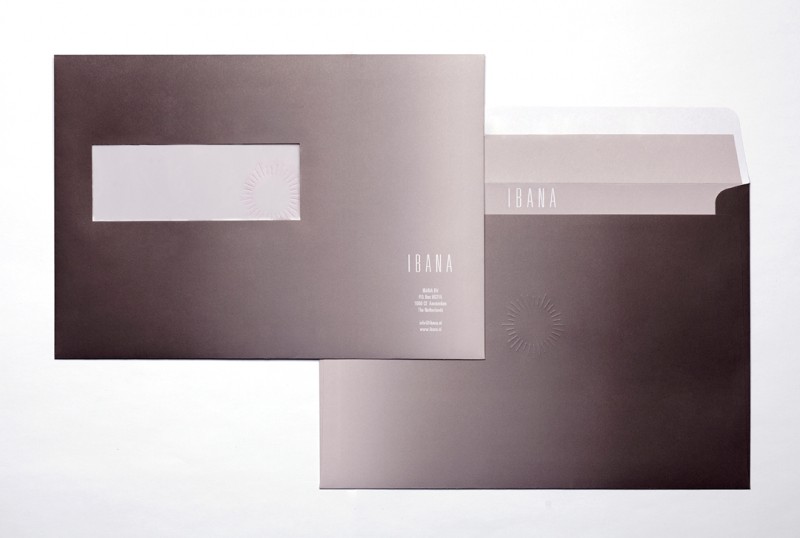
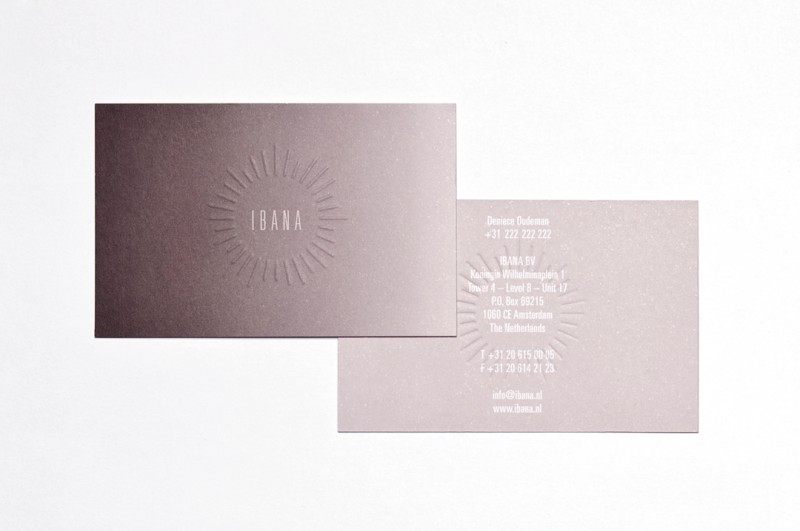
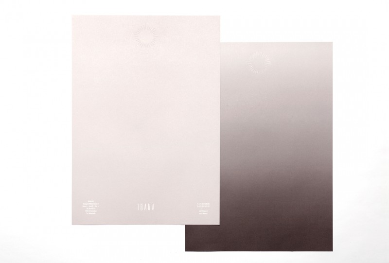
The visual identity sprung from the brand story. The logo had to be iconic and able to carry the now clearly identified brand. It also had to communicate a human, nuanced feel. The beams visualize the sparkle that grew from the collaboration of the four women. The wordmark IBANA is at the core of this slightly magical image. To amplify the dynamics and the range of the brand we added a trademark gradient colour scheme as well.
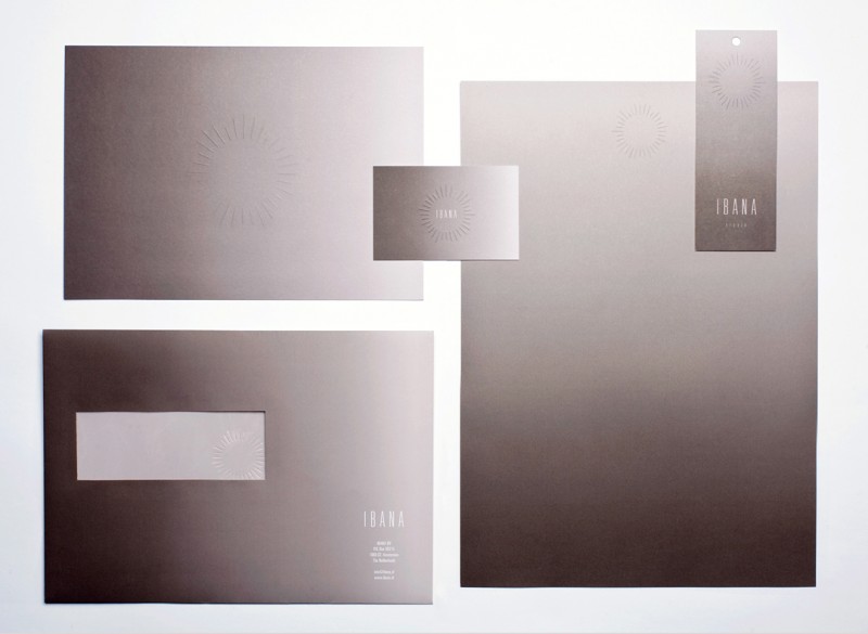
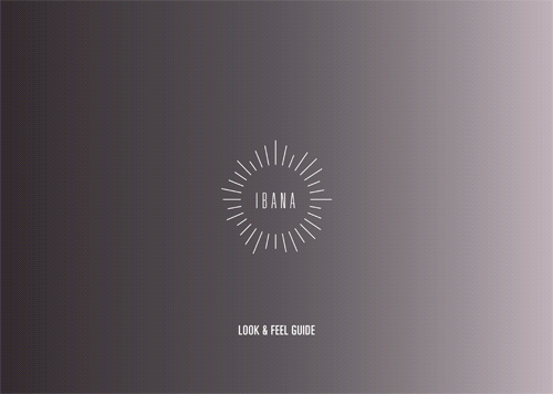
The logo and IBANA colours were applied on several carriers. Materials and production techniques were carefully selected to make the visual identity come to its full potential, making the re-branding as effective as can be. Next to that, we created the lock-up IBANA Studio, for IBANA’s recently launched clothing line. Lastly the Look & Feel Guide we produced ties the concept together once more; for IBANA’s employees it is a reference and a motivation reminding them of the strength of their brand, externally it is a clear groundwork for all future branding campaigns.
Details
Concept & art direction: Inclusief Amsterdam (Woes van Haaften en Shiran Gort)
Copywriting: Inclusief Amsterdam & Cathalijne Gietman
Graphic design: Inclusief Amsterdam & Willem van Roosmalen
Print: Pantheon Drukkers
Photography: Willem Popelier