MATE
Brand development / Visual identity
2011We developed a new name, logo and visual identity for production company MATE, based upon an extensive analysis of what sets this company apart from its competitors. We have given MATE a creative direction that can be used as a blueprint for all communication in the following years.
MATE produces a variety of merchandise for major fashion labels. Those products are meant for sales and promotion, ranging from packaging materials, store and fair displays to specials like limited edition bikes.
We found that like a friend, MATE is always there, prefers one-on-one contact and stands out by its fair costing. Next to that MATE gets ‘made’ whatever product is requested, upholding an impossible-is-nothing attitude. Based on these two characteristics of the company we got the idea of simultaneously evoking the words ‘made’ and ‘mate’.
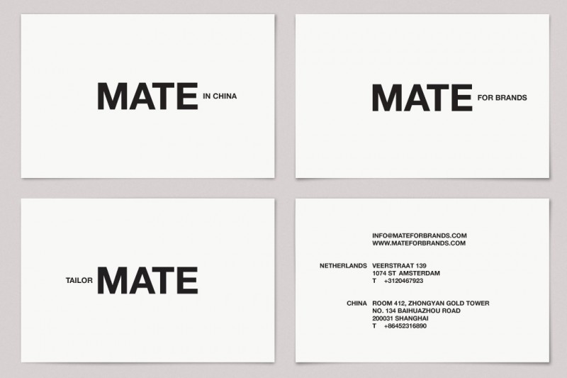
We wanted to continue the MATE wordplay in all aspects of the brand’s communication. Firstly, the business cards show different variations on this interplay. The most noticeable one is probably MATE in China, since all production takes place there.
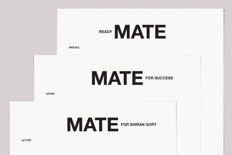
The header of the letter paper also shows the double meaning of the name. Products are made for Customer X, and the company acts like a MATE for Company X. Offers to (potential) clients – the beginning of a joined future – are marked by the words MATE for Success. Invoices are headlined by Ready MATE, since they are received when the project is finished.
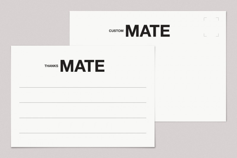
All of these identity carriers can be sent in envelopes – likely to pass customs considering MATE’s international nature – with a phrase that summarizes the company’s working method: Custom MATE.
(Contact details in the images are altered upon request of the client)
Details
Concept & art direction: Inclusief Amsterdam (Woes van Haaften en Shiran Gort)
Graphic design: Inclusief Amsterdam & Iksi