Orde van de Dag
Visual identity / Campaign
Website / Decor
We developed a visual identity, campaign, website and decor for a new and innovative theatre initiative called Orde van de Dag (Order of the Day) founded by Oscar Kocken & Greg Nottrot. This alternating ensemble of upcoming and well-established actors, musicians, writers and directors brings a theatre show in the Stadsschouwburg of Utrecht with a surprising look on the news, constructed largely by the power of improvisation. A critical and satirical tradition is combined with fast and comedic acting, a welcome development for the young and politically aware. Our concept communicates precisely this tickling combination of ‘current’ and ‘in-depth’.
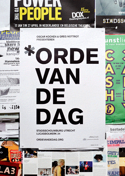
We created a poster that will be distributed in Utrecht before the first show. It will start relatively blank (thus already inviting interaction), showing only the names of Orde van de Dag and the Stadsschouwburg. The charm of suggestion is evoked, and immediate attraction comes from the use of simple yet strong graphics and colours. For each edition the posters are customized with stickers covering theme, line-up and date. Not only do these stickers remind of activism and the freshness that comes with in-the-moment action, they also represent the layerdness that Orde van de Dag advocates. Cause and effect are relevant to every news fact, and the outcome is usually a matter of perspective. Likewise, the posters evolve with time and are all unique.
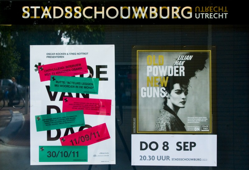
The stickers serve as flyers too. They replicate the poster design and give only a hint of information on each show and communicate the Orde van de Dag URL. That way more suggestion around the initiative is created and audiences are encouraged to visit the website.
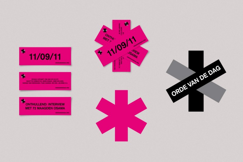
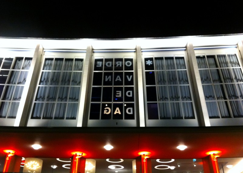
The Orde van de Dag logo is a continuation of the figurative language that the posters use. Placing the 3 stickers onto each other forms the asterisk. This sign expresses the Orde van de Dag character perfectly: asterisks are used as annotation marks and evoke the association of in-depth discussion, but they are also used as censuring marks and therefore remind of challenging and provoking.
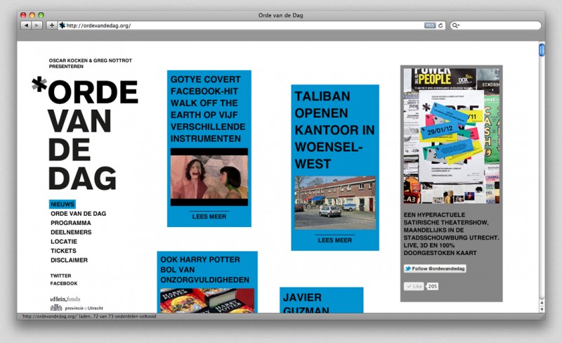
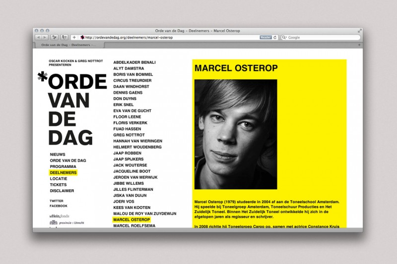
In the design of the website these factors come to full expression once more. Like the posters, the website becomes more layered and colourful along the way. All information, whether it is on the line-up or on topics, is categorized by use of the colours that are also used for the monthly stickers. The apparent order however has a hint of chaos. Each time the website is opened, the text boxes are shifted. The website stays up-to-date, gives new perspective each day and serves as a teaser for the next Orde van de Dag show.
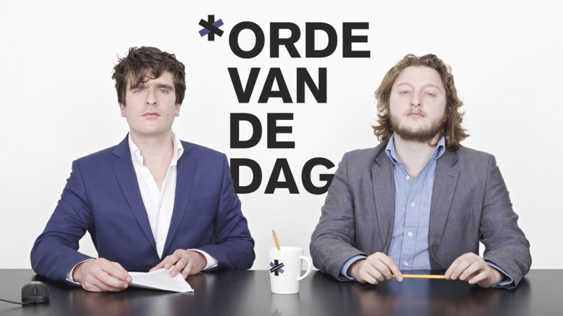
In addition to this we provided Orde van de Dag with a decor. A ‘backstage’ theme runs throughout, to make the audience feel as if they are actually witnessing how a news show comes about. On the opposite sides of the stage are corners for the writers and musicians that participate. The writers, like a ‘live’ editorial office, contribute by typing quotes, titles or any text they deem appropriate which is beamed directly onto a large screen that again changes with the monthly colour and so refers to the stickers that are used in the campaign.
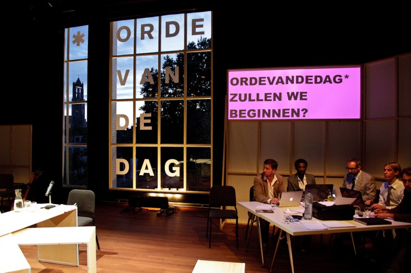
Photo: Willem Popelier
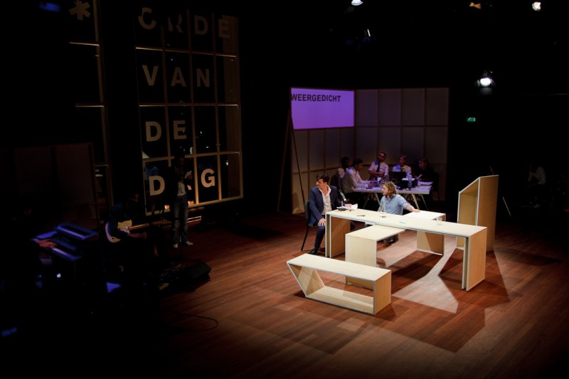
Photo: Willem Popelier
The writers and musicians sit in front of frames of clean wooden strips and white boards, like the backside of temporary walls used in galleries. The frames match the concept of putting the backstage in the front, as well as the eye-catching construction in lines and rectangles of the large window in the background that overlooks the city of Utrecht. On that window, which perfectly fits the setting since many discussion and late night TV shows have such a city backdrop, a large and slightly exaggerated Orde van de Dag title with the characteristic asterisk repeats the poster lay-out.
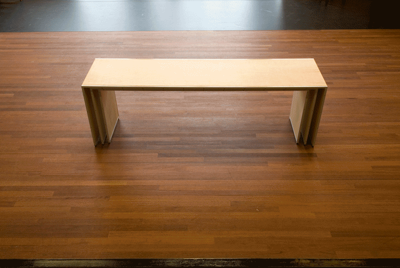
Finally we designed two catheters that can double act as benches for the participants, as well as the centrally placed, obviously ‘front stage’ asterisk table. The anchorman and his possible guests or reporters perform here, making use of the various shapes the table can adopt. It is made to look even more central by the fake camera’s and stage lights around it – in all the audience is watching the backstage hassle and the front stage result at the same time.

Photo: Willem Popelier
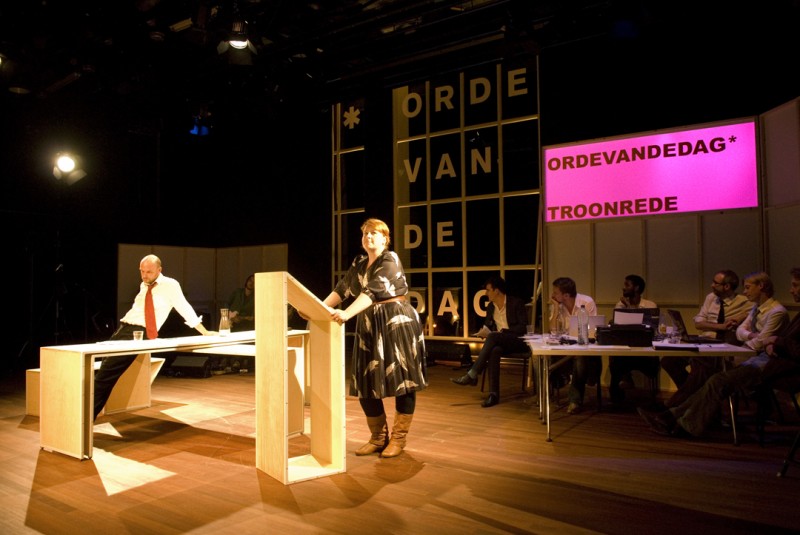
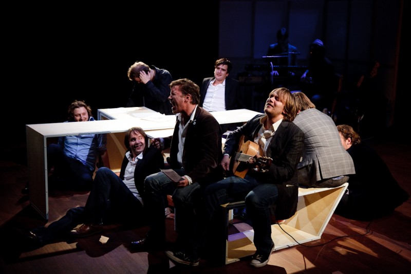
Photo: Willem Popelier
Details
Concept & art direction: Inclusief Amsterdam (Woes van Haaften en Shiran Gort)
Graphic design: Inclusief Amsterdam & Iksi
Web development: Iksi
Decor: Inclusief & Wouter Nieuwendijk
Photography: Willem Popelier