truly yours
![]()
Brand development
Name / Logo / Identity book
We developed a brand identity for Dutch beauty platform truly yours. On this website women are able to subscribe to the monthly surprise box filled with luxury samples and even full size versions of new beauty products. On the blog the team gives its followers updates and tips & tricks. With a strong name, logo and identity book we assisted truly yours in approaching future partners and media before the launch.
The name truly yours clearly refers to the surprise box that members are treating themselves to. Indulgence is what the brand would like to stimulate. The name also highlights the personal service and advice that are given through the website. truly yours is a new friend, with whom you build a long lasting relationship, probably without even noticing it.
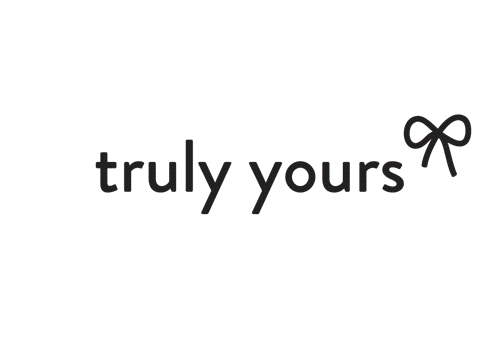
truly yours targets fashionable women with a special curiosity for innovative and high-end beauty products. As the logo should be the first thing to trigger this audience, we choose a font that is clean, elegant, feminine and distinctive, for both headlines and body texts.
We added a bow, again for its direct reference to the surprise box and because it seamlessly fits all the specific characteristics of the brand name too; a bow has this make-you-feel-special-factor. Next to that, bows are also beloved by the target audience of truly yours, clearly visible in the frequent usage of the form on shoes, handbags, jewellery and lingerie. The position and colours of the bow may vary with seasons, special occasions or form of communication.
In the identity book we tight the brand concept together and gave hints for future campaigns. The truly yours website was launched on January 4th, 2012 and the first surprise box was sold out within 1 week.
Details
Concept & art direction: Inclusief Amsterdam (Woes van Haaften en Shiran Gort)
Copywriting: Inclusief Amsterdam
Graphic design: Inclusief & Willem van Roosmalen